Oct 22, 2026 · Event Fabrication & Materials
Dimensional Letter Materials Compared: Acrylic, Metal, Foam and Wood
How acrylic, metal, foam and wood letters differ in the shop and on site: depth and weight, edge and finish quality, lighting compatibility, outdoor performance, mounting hardware and reuse, and how a fabrication shop chooses between them.
Dimensional letter materials come down to four families: acrylic, metal, foam and wood. The right one is set by viewing distance, whether the piece is lit, whether it lives outdoors, and whether it has to survive a second install. Pick for those four conditions and the finish, weight, mounting method and freight plan follow almost automatically.
At Pop Up Your Brand we cut, weld, carve and paint letters in the same Midtown Manhattan shop, which means the material conversation happens before the drawings are finalized rather than after. This guide works through dimensional letter materials one family at a time: what each substrate does under light, how it gets its thickness, what fails first, and what it demands at install. For the wider picture of letter types, illumination and placement, our guide to dimensional signage and 3D logo walls covers the ground above this one.
Four Questions That Decide the Material
Viewing distance sets thickness and edge quality. A logo read from across a show floor can be a painted panel-goods letter with a clean routed edge; a logo guests stand beside at a photo moment is judged at arm’s length, where a soft foam edge or a visible composite core reads as cheap in every photo taken that night.
Illumination sets translucency. If light has to come through the face, the face has to be acrylic, and the thickness and color of that acrylic determine whether the lit face looks even or shows hot spots over the diodes. If light only has to wash across or behind the letter, the face material is free and the structure behind it becomes the real question.
Environment sets the substrate. Salt air, direct sun, sand underfoot and overnight temperature swings eliminate materials that perform perfectly indoors. MDF is a reliable interior letter and a liability outdoors, because once moisture reaches an unsealed edge the face swells and no amount of paint hides it.
Reuse sets the joinery. A letter built to ship once can be a single glued-up piece. A letter built to go out three times needs mechanical fasteners, replaceable faces and a crate pocket sized to it. That decision changes the material, not just the hardware, and it is worth making at the brief stage rather than discovering it when the crate comes back. Our broader event fabrication materials guide maps the same substrates across scenic walls, bars and props; the sections below stay on dimensional letter materials.
How Each Family Gets Its Depth
Dimensional letter materials differ most in how they build a return. A letter has a face, a return and a back, and each family gets that depth a different way. The method is what drives weight, seam visibility and how the piece behaves on a truck.
| Family | How the depth is built | Effect on weight | Where a seam can show |
|---|---|---|---|
| Cast acrylic | Solid stock, or layers laminated with solvent cement | Heavy per inch; thick letters get hefty fast | Lamination lines, visible when edges are polished |
| Fabricated aluminum | A flat face with a formed or welded return | Light for its stiffness; hollow inside | Corner welds and the face-to-return joint |
| EPS or HDU foam | Carved from a block, or stacked and bonded billets | Negligible; wind becomes the load case | Glue lines between billets, telegraphing through coating |
| Panel goods | Stacked layers on a cleat, or a face with mitered returns | Moderate to heavy depending on thickness | Ply edges and miters at the corners |
Depth also decides how a letter gets cut. Thin sheet is nested and run on the CNC in a single pass with tight tolerances between repeated characters, which matters when a wordmark has to kern correctly once the letters are set on a baseline. Thick stock means multiple passes, a roughing and finishing strategy, and a tool path chosen for the edge you want to see.
Acrylic: Clean Faces and Edges That Carry Light
Acrylic is the material of choice when the brief asks for optical quality. Cast acrylic machines and polishes far better than extruded sheet, holds its color under UV longer, and takes a flame-polished or diamond-polished edge that looks like glass. Extruded sheet is flatter and more forgiving for simple painted faces, but it is softer, more prone to crazing near stressed fastener holes, and it will not give the same edge.
Edge treatment is where acrylic earns its place. A polished edge picks up any light introduced into the sheet and glows along the cut line, so a clear letter can read as a bright outline with no diode visible anywhere. That effect only works if the edge is genuinely optical: a saw-cut or laser-frosted edge scatters the light and the glow goes muddy. Our shop finishes those edges by hand after cutting, because the difference is visible from across a room.
Color strategy on acrylic splits into through-color stock, second-surface paint applied to the back of a clear sheet, and printed or vinyl faces. Second-surface paint on clear acrylic gives a wet, deep look that photographs beautifully under venue lighting, and it protects the color from fingerprints because the face guests touch is bare acrylic. Through-color sheet is the right answer for backlit faces, where paint would block the light.
The large-scale sculpture we designed and fabricated for One Love at One World Observatory was an acrylic argument from end to end: clear layers so the real skyline stayed the hero, every layer CNC-cut and edge-polished in the shop, a rainbow One World Trade Center at the center, and integrated LED lighting introduced so the polished edges did the work. It sat on an internal steel armature engineered for floor loading and public interaction, and it held its finish across thirty days of hands on it.
What acrylic asks for in return is careful handling. It scratches in transit, so faces get masked and crated with protection in place, and the mask comes off at the venue rather than in the shop. It also expands and contracts more than the hardware holding it, which is why mounting holes get oversized and letters are never pinned rigidly at both ends of a long span.
Metal: Aluminum for the Face, Steel for the Structure
Metal letters divide along a clean line. Aluminum is what you make the letter out of; steel is what you make the thing holding the letter out of. Aluminum composite panel is light, flat and cheap to cut, and it carries vinyl or paint well, but a raw cut edge shows the dark polymer core, so it needs a capped or fabricated return anywhere the edge is visible at close range. Aluminum plate costs more time at the saw and the brake, and it rewards that time with a true machined edge and anodized or brushed finishes that read as permanent.
Mirror and polished finishes deserve their own warning. They photograph extraordinarily well, which is exactly why brands ask for them, and they show every fingerprint, every scuff from a work glove and every weld seam that was not dressed flat. A mirror letter is really a finishing job with a fabrication job attached, and the schedule has to reflect that: the polishing happens after all welding and grinding is complete, and the piece is wrapped from that moment until it is standing on site.
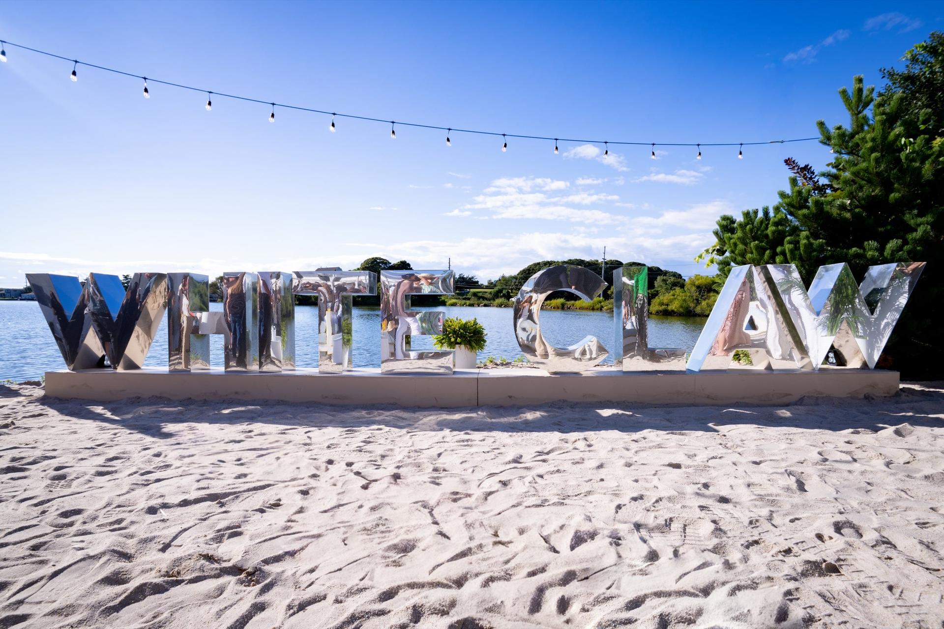
Outdoors, metal brings its own chemistry. Salt air attacks unprotected steel quickly, dissimilar metals in contact corrode where they touch, and fasteners are the first thing to fail. The nine oversized mirror-finish WHITE CLAW letters we fabricated and installed on the sand at The Surf Lodge were built as individual units on a low plinth base, engineered for sand, deck, salt air and wind rather than for a ballroom floor. Building them as separate letters rather than one assembly meant each unit could be leveled independently on a surface that does not stay level, and it kept every piece inside a size our crew could carry down to the waterfront.
When a letter has to span, cantilever or stand freely, the answer is usually a welded internal frame with a lighter face applied to it. That is a metal fabrication and welding problem solved in the shop, not an install problem solved on site with brackets, and it is the single most common reason a letter that looked fine in a render needs an engineering pass before it gets built.
Foam and HDU: Scale Without the Freight
When a letter has to be oversized, carved, rounded or sculptural, foam is the only sane material. Expanded polystyrene can be cut to depths that would make an acrylic or plywood letter unliftable, and high-density urethane board takes crisp detail and holds a painted finish without the grain and knots of wood.
Foam always needs a coating. Bare EPS dents under a thumbnail, absorbs paint unevenly and tears at the corners, so a hard coat goes on before any finish: a troweled or sprayed shell that gives the piece a paintable, impact-resistant skin. Skipping that step is the most common way an oversized letter looks perfect in the shop and arrives at the venue with a dent in the counter of the R. Our guide to foam fabrication for events goes deeper on densities and carving.
The counterintuitive risk with foam is that it is too light. A letter that weighs almost nothing has no resistance to wind, no resistance to a guest leaning on it, and nothing for a fastener to bite into. So foam letters get internal armatures, bonded base plates, ballast pockets or plinths, and the engineering effort moves from the letter to whatever is keeping it upright.
Wood and Panel Goods: Texture, Warmth and Shop Speed
Baltic birch plywood and MDF are the workhorses of letter fabrication, and they are chosen for two different reasons. Birch is picked when the layered edge is part of the look, when the piece needs to take a screw and hold it, or when a stacked lamination builds depth faster than solid stock. MDF is picked when the face has to be dead flat and perfectly painted, because it has no grain to telegraph through a finish.
Both move with humidity, and both punish an unsealed edge. MDF in particular wicks moisture through its cut faces, so every edge gets sealed before primer, not after. Our scenic painting team treats an MDF letter as a sealing job first and a color job second, which is why a rushed paint schedule shows up as a rough edge months later rather than on install day.
Wood also brings something no other family offers: real material character. The reclaimed-wood WHITE CLAW entrance sign we built for the same Montauk takeover did a job a polished acrylic letter could not have done, because the texture and tonal variation of the boards carried the whole message before anyone read the word. When a brief calls for warmth, weathering or craft, the material itself is the design, and the fabrication question becomes how to keep it flat and mounted safely.
Mounting, Weather and the Second Build
Material and mounting are one decision. Standoffs through an acrylic face need oversized holes and a face thick enough not to craze. Stud-mounted metal letters need threaded hardware welded or bonded to the back, located off the drawings so the pattern lands on the wall framing rather than between it. Stacked panel-goods letters sit on a cleat. Foam letters sit on a plate or a plinth. Choosing the mount late means drilling a finished face on site, which is how a perfect letter picks up its first flaw.
Three conditions change the answer more than any other: wind, water and hands. Wind turns surface area into load, which is why an oversized outdoor letter is engineered as a sail with a base rather than as a letter. Water finds horizontal surfaces and unsealed edges, so an outdoor letter is detailed to drain rather than to hold. Hands find everything at a photo moment, which is why anything guests reach gets specified up a grade in both material and finish.
Reuse is the last filter, and it rewards the more durable material almost every time. The dimensional monday.com logo with color-changing LED that we fabricated as the entrance hero for MP Live at Pier 36 had to go up in a two-day load-in and come down in an overnight strike without damage, which makes the same demand a second deployment makes: replaceable faces, hardware reachable without destroying the finish, and sections sized for the door they came through. Specify a letter that way and the second build is an install; specify it for one night only and the second build is a rebuild.
If you have a wordmark, a logo or a sculptural letter set in front of you and are not sure which material the brief actually calls for, send us the artwork, the venue and the dates and we will tell you what we would build it from and why. Start a conversation on our contact page, and bring whatever you have, even if it is only a reference photo and an install window.
Frequently Asked Questions
Frequently Asked Questions
There is no single best material. Acrylic wins when the piece is lit or seen at arm's length, because it polishes to an optical edge. Fabricated aluminum wins outdoors and anywhere a mirror or brushed finish is the point. Foam wins when letters are oversized or sculpted. Plywood and MDF win when the face must be flat and painted and the schedule is short.
Yes, but the material and the base have to be specified for it. Outdoor letters need sealed edges, corrosion-resistant hardware, finishes rated for sun and a base engineered for wind rather than for a flat interior floor. Unsealed MDF and uncoated foam do not belong outside. Sand, salt air and overnight temperature swings all shorten the life of the wrong substrate.
Light has to pass through the face, so the face must be acrylic. Through-color or white translucent cast acrylic gives an even lit face, with the thickness and diffusion chosen so the diodes behind it do not read as hot spots. Edge-lit effects need a genuinely polished edge; a frosted or saw-cut edge scatters the light and the glow looks muddy.
Thickness follows viewing distance and the depth of shadow the design wants, not a rule of thumb. Letters read from across a room can be relatively thin; letters guests stand beside need enough return to cast a real shadow and hide their own hardware. In acrylic, thickness comes from solid stock or laminated layers; in aluminum, from a formed return behind a thin face.
Often, if they were built for it. Reusable letters use mechanical fasteners rather than permanent adhesive, replaceable faces, hardware that can be reached without destroying the finish, and sections sized for the crate and the doorway. Acrylic and aluminum survive repeated handling best. A letter built for a single night can usually be refurbished, but the face is what gets rebuilt.